Website design trends are going to evolve in 2020, just like they have every year before. Websites today look far different from websites 20 years ago, 10 years ago, and even just a few years ago. And websites a decade from now will look a lot different then websites today.
If you want to launch a new website you should know all the latest trends. Selecting the right brand pieces, UI elements, and other things could boost conversions and strengthen perceptions of your organization. On the other hand, poor choices could damage your brand, slow your site, and chase customers away.
It’d be hard to predict what the World Wide Web will look like in 2030. However, we can look at several emerging and on-going trends that will affect web development and site design in 2020. If you want the most advanced, highest converting website, then you have to consider not just today’s trends and ideas, but tomorrow’s as well.
Let’s take a look at XXX trends that will shape web development in 2020.
Mobile First Will Build Momentum
Competent web developers have been focusing on mobile-friendly websites for some years now. More than half of all web traffic now comes from mobile devices and that number is likely to increase in the future. Now, some websites are moving to a “mobile first” philosophy.
These sites aren’t just mobile friendly, they emphasize mobile use almost exclusively from the basic code up. Mobile users are not an afterthought, their needs come first and foremost. In the near future, mobile first websites may begin to replace responsive websites as the go-to.

While a well-coded responsive website can be great on a mobile device, many sites still offer mobile users a subpar experience. With mobile first, the site is coded from the start with the needs of mobile users in mind. This results in a much better mobile experience.
Mobile first websites often feature:
- Less content
- A very simple design
- High speeds
- Ease of use no matter the screen size
Even if you don’t adopt a mobile first strategy, you absolutely must take the needs of mobile users into account during the design process.
AMP Will Continue to Supercharge Speeds
AMP, or “Accelerated Mobile Pages”, is a Google-backed effort to make the entire World Wide Web a faster place. This is especially great for mobile devices as AMP encourages quicker, less data intensive downloads, thus easing constraints on data plans.
AMP encourages code to be stripped down. For example, many applications of JavaScript are forbidden. Likewise, images will only load if you scroll to the part of the website where the image will be displayed. When used properly, AMP can greatly enhance web and mobile experiences.

AI’s Impact on Web Design Will Increase
Artificial intelligence might feel like a “buzz word”, something everyone is talking about but doesn’t actually have much real-world impact. Artificial intelligence, however, is already a big deal and has had a profound impact on the web.
Google’s search engine is increasingly reliant on neural matching and machine learning. AI powers Amazon’s recommendation engine, Alexa, and Amazon Go. AI is making big data accessible and useful. That data, in turn, can be used to inform web design.
AI also powers chatbots, which are immensely useful for many businesses and can be plugged right into your website. Chatbots can be used to provide customer service around the clock. A chatbot can answer simple questions and when necessary, escalate an issue to a person.
Expect Richer, More Dynamic Colors
For some time now, web design has been dominated by minimalist design philosophies. Many sites feature tons of white space and often only splashes of color. Black and white designs have also been quite popular. This has resulted in clean, easy-to-navigate websites.
However, the World Wide Web has become a rather bland place. Many websites look alike and for users, it can get rather boring. Now, cutting edge web developers are bringing more colors back into the mix. Well-done gradients are becoming especially popular. Gradients add subtle touches of color while still allowing you to craft modern, elegant designs.

In general, websites should become more colorful moving forward. Minimalism will still be out in force but won’t be as bland. Clean, elegant designs with splashes of color will become a mainstay.
Expect More Shadows Too
The same creative thought processes driving gradients is also encouraging web designers to use soft shadows. A subtle shadow could make your website and brand feel more alive and organic. Shadows also create depth, lending your website a 3D feel.
Flat websites have been all the rage for some years now. This means subtle shadowing can give your site and brand a distinctive feel. Even if you decide to stick with a relatively utilitarian design, well-placed shadows can offer just enough oomph to draw the eye.
Hand Drawn Doodles Will Be Big
Another way web designers are standing out is by using cartoons. The hottest toons right now are probably hand drawn designs (or least designed to look hand drawn). You’ll notice that many of these cartoons look like they were drawn by children.
Hand drawn cartoons offer a great way to contrast with the sleek, utilitarian designs and brand elements that have been so dominant over the last decade. Many companies have been investing huge sums into redoing their branding to make it simpler, cleaner, and “flat.”
Yet now these designs are so common that your brand may struggle to drum up attention. That’s where hand drawn cartoons come in. They flip the utilitarian design philosophy on its head by offering organic, eye catching imagery.
Abstract Illustrations Could Be Quite Hot as Well
Not all cartoons and graphics will have a, well, cartoonish look. Abstract illustrations offer another great way to draw the eye. Abstract illustrations can be tricky and if done wrong, can confuse users. Yet when done right, they really pop off the page. Just make sure you clearly convey what you want.
Whether you should go with hand drawn cartoons or more abstract images will depend on your brand and website.
The World Wide Web Will Become More Inclusive
The Internet is slowly becoming more inclusive, catering to people with different accessibility challenges, such as being blind, deaf, or having limited mobility. A lot of developers have been working to make the web more inclusive, but developing new technologies, methods, and processes is easier said than done.
How do you make a website that is navigable for someone with no vision? Screen readers can convert text into spoken word, while refreshable braille displays can convert elements into braille. For web developers, simple steps, like ensuring that photos are accompanied with accurate, descriptive text, can make the Internet more accessible.
Going forward, don’t be surprised if more emphasis is placed on making the Internet a more accessible place.
More Video Content
Many brands and websites have been turning to explainer videos and other videos to inform, sell, and interact with visitors. This trend is already well underway and isn’t likely to slow down in 2020. Currently, video represents roughly 60 percent of downstream volume globally. By 2022, it’s estimated that video will account for more than 80 percent of Internet traffic.
If you’re not using videos, you might be missing out on opportunities and conversions. A well-placed explainer video, for example, could help you move products and services.
Now, some web designers are turning to video hero headers. Instead of being greeted by static pictures and slogans, visitors are immediately shown a video on the home page.
Dark Mode
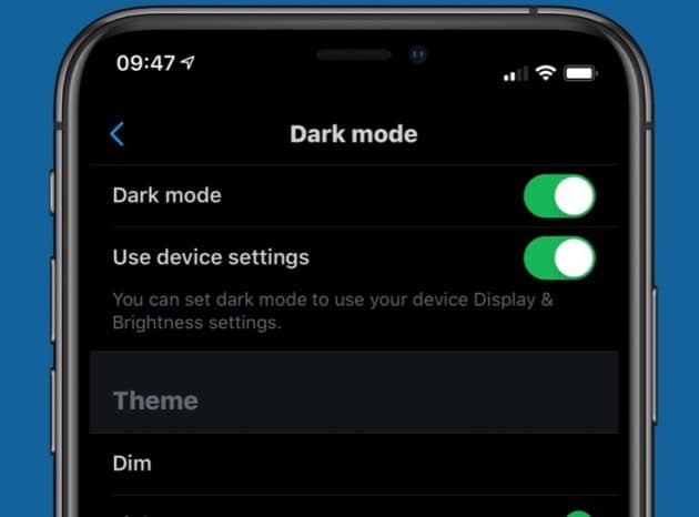
Staring at a bright screen all day can be hard on your eyes. And while well-done white space looks great, it can be especially harsh. That’s why many apps and some websites now offer “dark mode”. Simply by hitting a toggle or selecting the right settings you can switch an app or website over to an eye-pleasing dark mode.
Much of the white space will be converted to dark grays and blacks. Sometimes other elements will be darkened or subdued as well. This decreases the amount of harsh light pouring out from your screen and reduces strain on your eyes.

Dark mode is especially popular for people on their smartphones and computers at night. Bright light in dark environments can be especially harsh. However, many people prefer to use dark mode during the day.
You might worry that dark mode will damage your brand, but skilled website developers can develop dark-themed sites that look just as good, if not better, than your regular website.
Increased Personalization
Websites are going to become more personal moving forward. Many websites offer the same experience for every visitor. While these websites might be data-informed, providing the most popular content to the audience at large, many are not customized to individual visitors.
That’s going to change. Let’s say you run an online newspaper. You might show all of your visitors “trending” or “popular” articles based on your data and what your audience at large is reading. What if you could customize the content that is presented to individual users based on their usage habits?
Let’s assume there are a lot of political developments in a given day and most of your trending articles cover political topics. However, what if a user visits your website, but past behavior shows he’s not interested in politics but instead your sports articles?
With AI and data, you will be able to build websites that recognize this and automatically adjust. In the case of the above visitor, they can be presented with more sports-related content.
Already, Amazon uses AI to offer personalized product recommendations and Netflix will suggest TV shows and movies based on your past behavior. This ensures the content is more relevant to individual users. In the future, more sites will offer such customized experiences.
The Future is Here
There you have it. The above trends are going to have a big impact in 2020 and beyond. As exciting as these developments are, technology is only going to improve. The websites consumers enjoy ten years from now will be a lot more advanced than the ones we design and code today. But that’s a good thing, it’s a sign of progress.